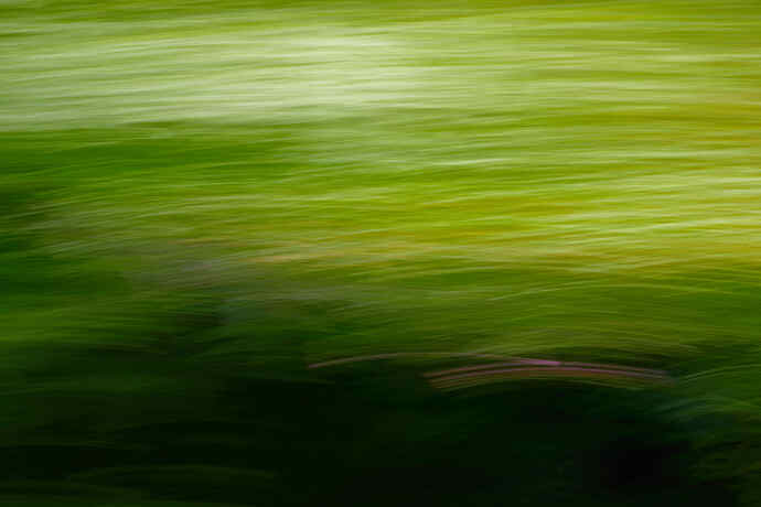
On a trip to the coast this spring I was attempting to get some motion images by taking shots out of the passenger window of the flowers and grass along the road. This is the only one I liked enough to work on in post processing. I ended up flipping it vertically because I like the balance better.
Richard I really like this image. The textured waves of complementary colors are simultaneously exciting and comfortable. The lower darkness and the upper bright area should fight with each other, but for me they provide an exciting tension. The lower dark area acts as a foundation.
The only nit I can offer is that the pink lines start (end?) quite abruptly on their left. In the revision, I did a bit of rightward motion blur on a bit of green to their left.
By the way, as of yet there is no way to send alerts to site participants that a new image is available to be seen. The only way I know to do that is to include their @names in the text for that new topic. Press the @key and select one person’s name, and repeat until all are in the text. I can do that for you if you wish. I will work with David Kingham to see if he can tweak the site to make this easier.
Thanks Dick. Not sure what you mean by adding the green motion blur, but I didn’t see enough of a change to make any difference in the image for my eye. I seem to get a sense of peace with the image even though it has a lot of motion.
Yes, a wonderful blend of peace and motion.
@cthielhorn @Williamharris @Dorinda @bodori @MJD @doughall @discobot

